BaseCreate

Bringing ideas to life

Hong Kong Airport

Speeki

LENZING™ ECOVERO™

VEOCEL™

Board Riders Wipeout Club

The MOD

Hotel Jen

CITIC Capital

Château de Sours

RARE SkinFuel

TENCEL™

NUSTAR Resort

The Whitney

Two Hyde Park Square

Cloud Light

La Maison du Chocolat

Muon Activewear

Confirmity

A S T R I

Androsophy

Pickabowl

Aiconik

Manuka Royale

Bacardi Group

Okada Resort

Prezlock

Tsuchiya Kaban

Re>Pal

City di Mare

Quantifeed

Fleet Management

English Schools Foundation

International Christian School

Hibiki No Mori

Nakamichi

Dehres Jewellery

APM Monaco

Eatology

K E F

L. I. F. E.

Mémoire

Mandarin Oriental

Chaumet

Audemars Piguet

St. Regis

De Beers

Panerai

Deloitte

La Perla

TENCEL™ Luxe

Start Me Up

Dufry

Bank of East Asia

What we do and why

Design for your whole journey

Brand Strategy & Voice

Branding & Design

Digital & Web

Content & Campaigns

Events & Activations

Design for your industry

Corporate

Consumer Products

Hospitality

Fashion & textiles

Manufacturing and industrial

Technology

Food & Beverages

Logistics

Health & Wellness

Real Estate

Education

ESG & Sustainability

Experiences that move people

News and Insights

Branding in the metaverse

Rebranding a contruction leader

Increase your brand loyalty

What is brand voice?

Time for a brand check-up?

Creating Positive Impact

Let's talk

Success

Error 404

Privacy cookie policy & terms

Styleguide

Thanks for reaching out

Team

Matthew Kinsman

Winning hearts and trust

View View

Case Study© 2012

LET IT FLY ENERGY

Let It Fly EnergyHong Kong© 2012

Let It Fly Energy

Sparking New Life into the Asian Energy Drink Market

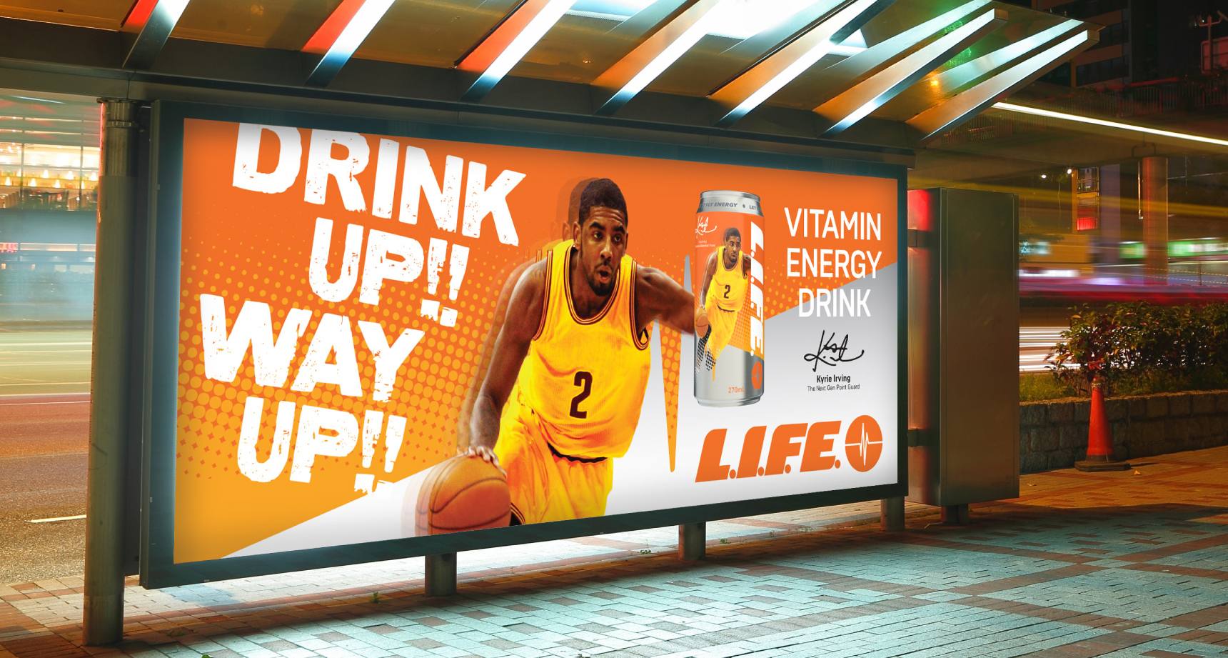
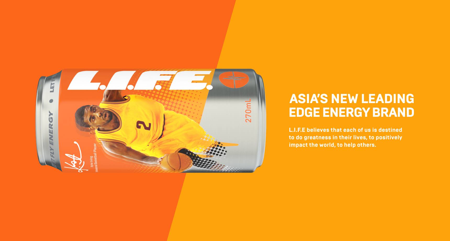
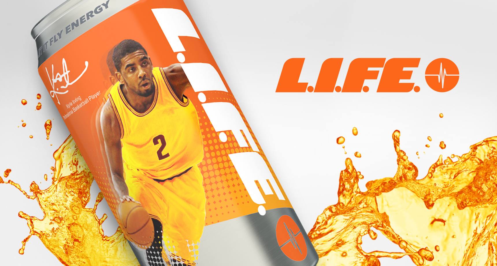
The Let It Fly Energy, or L.I.F.E., line of energy drinks is the healthy alternative energy drink for athletes. With success growing in the United States, the brand wanted to launch in other global markets – starting in Hong Kong. With ambitious aspirations, L.I.F.E. reached out to BaseCreate to conduct competitive analysis, brand strategy, brand identity and a brand book.

We established a new localized brand position centred on the concept of "way up positivity," a slang term that resonates with the basketball-playing community in Hong Kong.

Through several rounds of qualitative focus groups, clearly defined values helped launch the brand, starting with a new L.I.F.E. logo designed to be boldly in motion. Furthering associations with basketball, orange was chosen as the brand colour to highlight the energetic nature of the brand and the lifestyle it offers.

Packaging drew inspiration from the energy it contained. Sitting alongside notable energy drinks, we knew that packaging needed to pack a strong visual punch that would differentiate it from the rest. Focusing on its identity as “for athletes” and a healthy alternative, several designs were drafted, tested qualitatively and prototyped featuring bold colours, silhouettes of basketball players and images of heartbeat lines.