BaseCreate

Bringing ideas to life

Hong Kong Airport

Speeki

LENZING™ ECOVERO™

VEOCEL™

Board Riders Wipeout Club

The MOD

Hotel Jen

CITIC Capital

Château de Sours

RARE SkinFuel

TENCEL™

NUSTAR Resort

The Whitney

Two Hyde Park Square

Cloud Light

La Maison du Chocolat

Muon Activewear

Confirmity

A S T R I

Androsophy

Pickabowl

Aiconik

Manuka Royale

Bacardi Group

Okada Resort

Prezlock

Tsuchiya Kaban

Re>Pal

City di Mare

Quantifeed

Fleet Management

English Schools Foundation

International Christian School

Hibiki No Mori

Nakamichi

Dehres Jewellery

APM Monaco

Eatology

K E F

L. I. F. E.

Mémoire

Mandarin Oriental

Chaumet

Audemars Piguet

St. Regis

De Beers

Panerai

Deloitte

La Perla

TENCEL™ Luxe

Start Me Up

Dufry

Bank of East Asia

What we do and why

Design for your whole journey

Brand Strategy & Voice

Branding & Design

Digital & Web

Content & Campaigns

Events & Activations

Design for your industry

Corporate

Consumer Products

Hospitality

Fashion & textiles

Manufacturing and industrial

Technology

Food & Beverages

Logistics

Health & Wellness

Real Estate

Education

ESG & Sustainability

Experiences that move people

News and Insights

Branding in the metaverse

Rebranding a contruction leader

Increase your brand loyalty

What is brand voice?

Time for a brand check-up?

Creating Positive Impact

Let's talk

Success

Error 404

Privacy cookie policy & terms

Styleguide

Thanks for reaching out

Team

Matthew Kinsman

Winning hearts and trust

View View

Case Study© 2019

masculinity embracing paternity

AndrosophyJapan© 2019

Androsophy

Androsophy is a Japanese baby sling brand blending ergonomic design, familial bonds, and cool, masculine aesthetics. The brand believes in evolving traditional gender roles by forging bonds within families.

Androsophy's vision for its brand and products is to focus on strengthening the relationship between babies and fathers with a carrier crafted for men. To accomplish this transformation of the family dynamic, the brand needed a name, strategy and identity that would balance style, masculinity and paternity. BaseCreate's task was to create a brand that would be appropriate and appealing to "cool" fathers – combining the role model of a father and a sophisticated man's style.

We made a brand strategy and name anchored to "the thought and wisdom of man", reflecting it through the brand name and the brand identity – blending it into the colour scheme, typeface, iconography, and all other brand activation.

the thought and wisdom of man

Brand Strategy

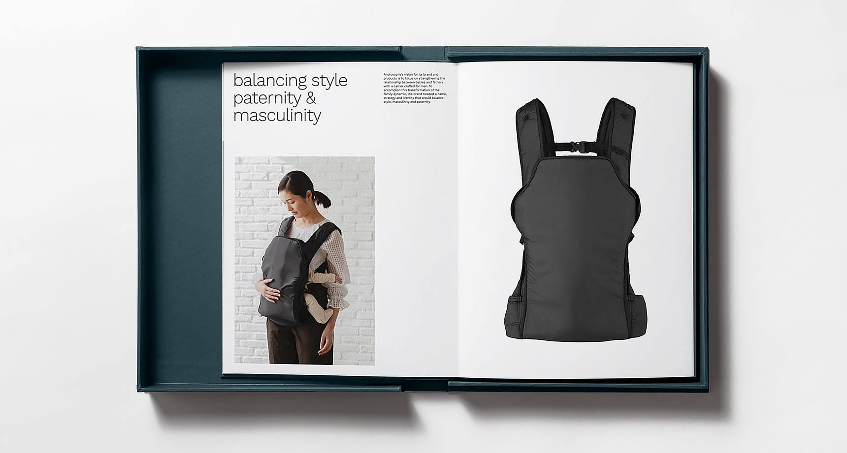
Androsophy was born with the idea of using the knowledge and views of men to raise children without giving up fashion – supporting fathers growing with their children through products they want to pick up, use and show off. To crystallise this vision, we helped create a unifying and insight-rich concept around the idea of "the thought and wisdom of man," guiding a brand providing a range of products for fathers and their families.

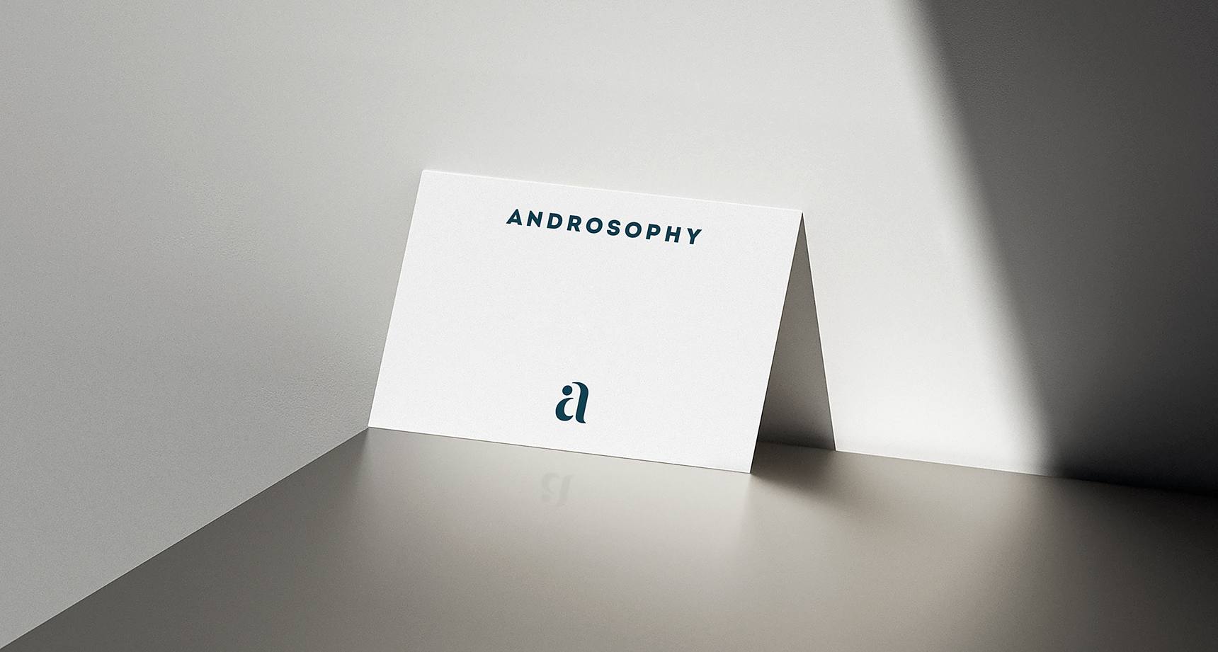
The brand name is derived from "Andro-", the root word meaning male, and "sophy", the suffix meaning thought or wisdom.

Together, the meaning of Androsophy is clear – this is a brand that understands men's thoughts and needs and offers products that men want, because it caters to function and style.

Based on shaping happier families through empowered fathers, we created a sophisticated brand identity system that caters to the modern man's style and function and understands every father's needs.

Combining human-centred design elements and a straightforward, uplifting voice that speaks to customers on their terms.

expressing the bond between father and child

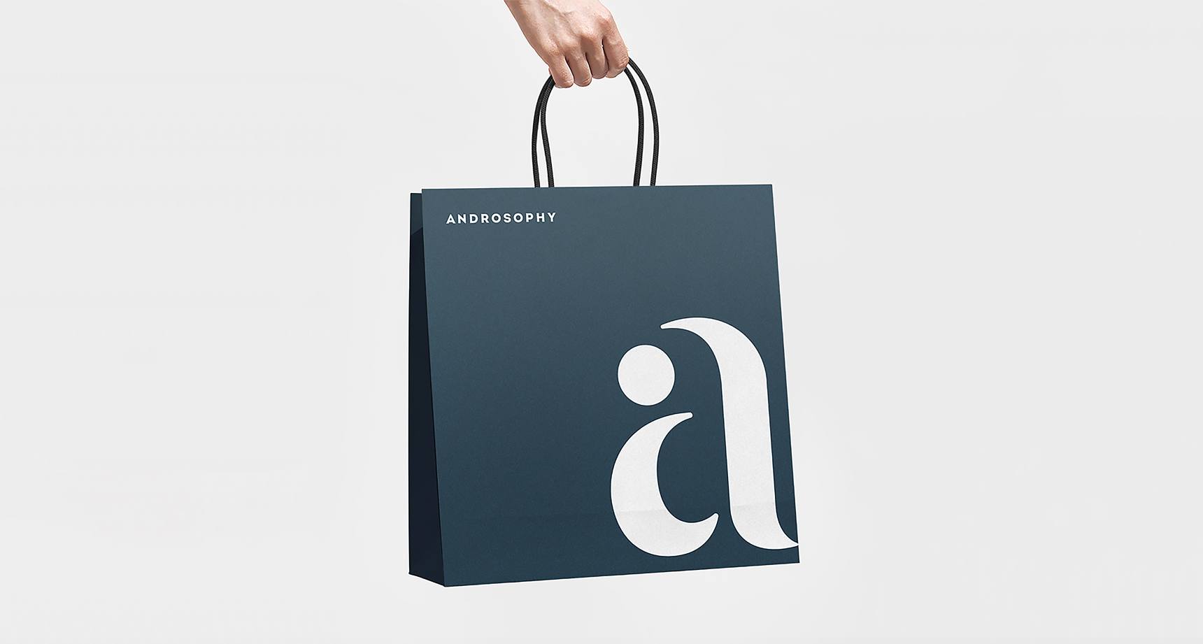
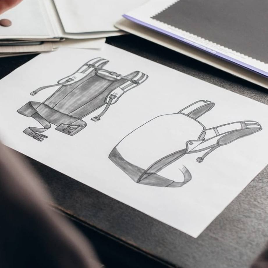
The logo creation process centred on the core value of Androsophy: the strong bond between father and child, the result of child-rearing by an empowered man and family.

Soft curved shapes are configured to replicate a lowercase "a" and imitate the form of a baby in a carrier held protectively by a father. A bold, sans-serif wordmark creates a powerful and contemporary impression, creating a modern logo suited for a child brand and representative of the brand strategy and naming.

Bringing the value proposition to life, we designed an identity that balances the softness expected from a brand for children and families, with the unique sophistication delivered to "cool" fathers. From the typography to the colour scheme, we balanced this dichotomy with strategic and aesthetic clarity.

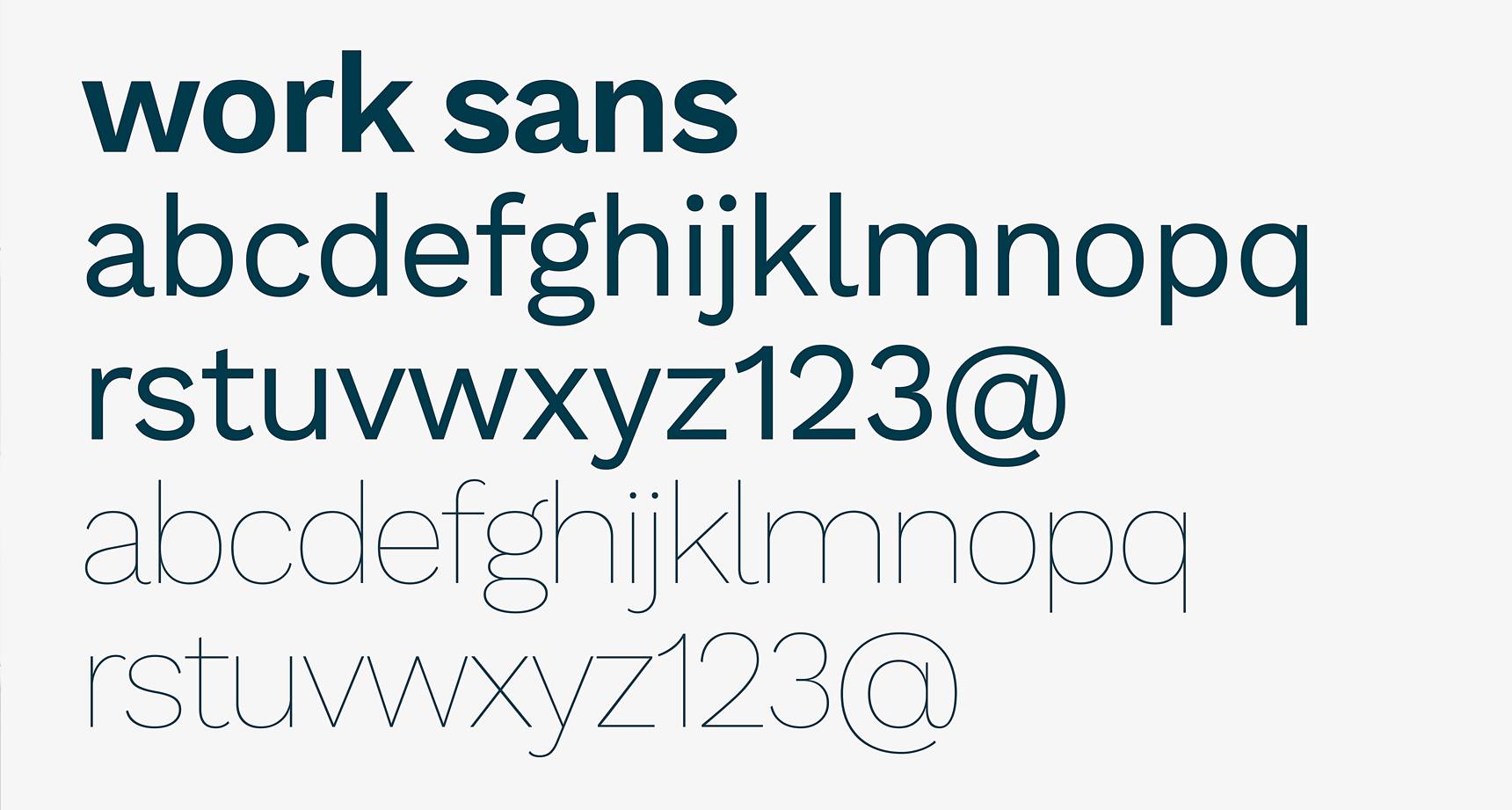
The typography needed to work hard across all applications, and was selected with approachability and digital applications in mind.

We wove the same compelling story through visuals and content across various touchpoints, activating a unified front and solid foundation for brand building.

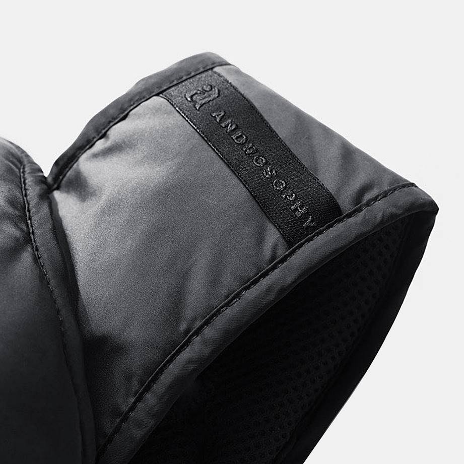
Expressing the proposition "the thought and wisdom of man" included creating marketing materials, packaging design and brand guidelines that convey the simplicity and clarity across language barriers.

Thanks
Super grateful to Asaki for giving us the opportunity to work on this project.